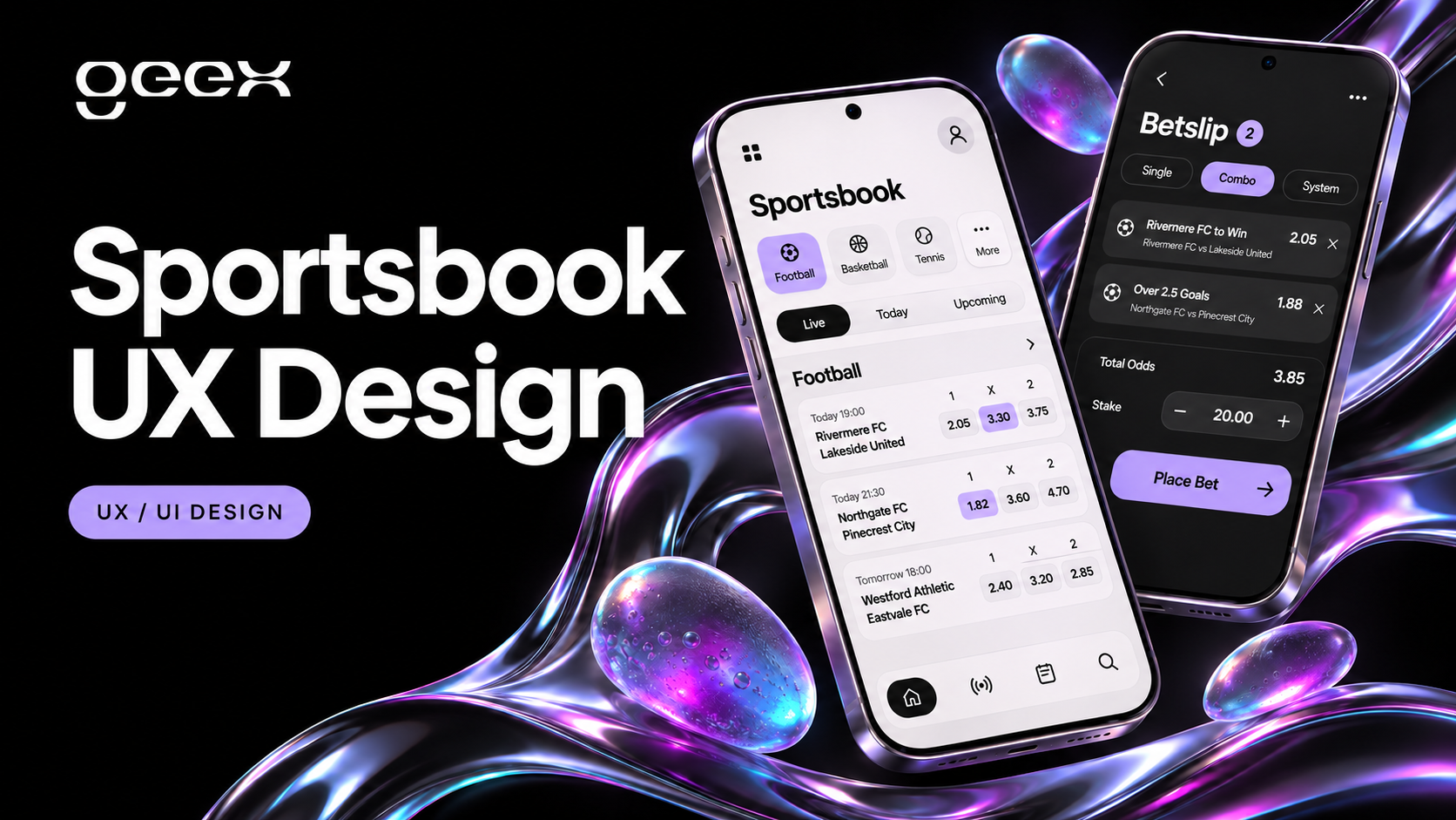
Sportsbook UX should help a person identify the right event, understand a market and see exactly what happened to a submitted bet. A visually polished interface can still fail these tasks when team labels disappear, prices change without explanation or a connection error leaves the bet's status uncertain.
For product teams commissioning sports betting app design, the useful starting point is a map of decisions and states. Design the transitions between browsing, selection, submission and confirmation alongside the screens themselves. The recommendations below concern interface behavior and integration requirements; they do not describe a betting engine or certify an operator's compliance.
Key Takeaways
- Preserve event and market context from the odds table through the receipt.
- Separate selected, submitting, accepted, rejected and unknown bet states.
- Treat price changes and connection failures as designed flows with provider-backed behavior.
- Test accessibility and recovery with realistic tasks before approving the interface.
Organize navigation around the event people need
A visitor searching for a particular match should not have to understand your content management system. Establish a consistent hierarchy such as sport, competition, event and market. Keep search available for people who know a team or competition name, and retain their browsing position when they return from an event.
Start by defining which information distinguishes similar events. A team name alone may be ambiguous across competitions or squads. Event cards should carry the relevant competition, participants, start time and event status. Localize time presentation deliberately and explain which time zone applies where ambiguity matters.
Separate live and scheduled events clearly. Avoid moving a row under someone's pointer when a game changes status or a feed refreshes. A visible update control or a stable grouping rule can preserve orientation while still reflecting new information.
For a first prototype, use tasks with clear outcomes:
- Find a scheduled match by team name.
- Find the same match through its competition.
- Open an event, inspect a market and return to the previous list.
- Explain whether an event is live, delayed, finished or unavailable.
These are proposed usability tasks, not claims about how every audience browses. Interview and observe the audience for your intended market before deciding which navigation deserves the most prominence.
Keep odds attached to their meaning
An odds value is only useful when its selection, market and event are clear. Carry these labels into compact mobile layouts rather than hiding them behind abbreviations that require memory.
Create component rules for long participant names, localized labels and alternate odds formats. A three-column market should keep its column labels visible or repeat the meaning in each selection's accessible name. A selected outcome needs a persistent state distinct from a temporary price-change highlight.
Design at least these market conditions before finalizing a component:
| Condition | Information the interface should preserve | Available interaction |
|---|---|---|
| Open market | Event, market, selection and current price | Select or remove an outcome |
| Price updated | Updated price and which selection changed | Review the current offer |
| Suspended market | Existing context and explicit suspension | No new submission for that market |
| Removed market | Explanation that it is unavailable | Remove or navigate elsewhere |
| Feed unavailable | Last known state distinguished from current data | Follow the defined recovery flow |
This matrix is a design proposal. The provider's actual market statuses and permissible actions must determine implementation. Do not introduce a frontend status that implies availability the platform cannot confirm.
Design the betslip as a stateful transaction
The betslip is a review and submission surface. It should let users inspect their selections, correct the stake and distinguish a potential return from a confirmed result. Explain whether a displayed return includes the stake and use the operator's approved terminology consistently.
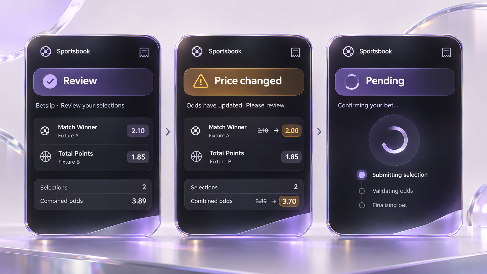
Separate a successful button press from a successful transaction. A loading animation confirms that an action started; it does not prove acceptance. The interface needs a defined response for every meaningful provider outcome.
| State | Recommended message purpose | Next action |
|---|---|---|
| Draft | Show selections, stake and applicable conditions | Edit or submit |
| Validation issue | Identify the specific input or selection problem | Correct the affected item |
| Submitting | Explain that confirmation is pending | Prevent accidental duplicate submission |
| Accepted | Show provider-confirmed details and reference | View the receipt or history |
| Rejected | Explain the returned reason in plain language | Review and make a new decision |
| Outcome unknown | Explain that status is being checked | Reconcile before offering a retry |
A timeout deserves special attention. For example, Betfair's exchange API documentation instructs clients to check current orders after certain timed-out requests before placing further orders. This is an exchange-specific example of why a connection error must not automatically become a retry button. Confirm your own provider's contract. Betfair: Betting Exceptions
In a hypothetical prototype, a user submits a selection and loses connectivity. The UI keeps a pending record, explains that confirmation is unavailable and checks the authoritative transaction state when service returns. It then shows the confirmed receipt or a confirmed failure. Engineering must define how that reconciliation works; a designer cannot solve it with copy alone.
Make changes noticeable without making the screen chaotic
Live data can create competing demands on attention. Establish a hierarchy: a submission result needs a different treatment from an ordinary price update. Avoid presenting every background change as an urgent alert.
For web interfaces, W3C's status-message guidance explains how relevant updates can be exposed to assistive technology without moving focus. Apply this selectively to meaningful feedback, such as a selection being added or a submission completing, and test the resulting announcements. W3C: Status Messages
Dense odds tables also need usable pointer targets. WCAG 2.2's minimum target-size criterion specifies 24 by 24 CSS pixels or qualifying alternatives and exceptions. Treat that as a criterion to evaluate, not evidence that every 24-pixel button is comfortable on a phone. W3C: Target Size (Minimum)
Review keyboard focus, zoomed layouts and screen-reader labels in the working interface. A static design file cannot demonstrate that a selected market remains understandable after focus moves into the betslip.
Keep account controls within the product journey
Users should be able to reach account history, support and the operator's gambling-management controls without losing track of their current task. Work with the operator's compliance team to determine the correct controls, terminology and behavior for each jurisdiction.
Design these surfaces with the same care as the main market list. Show the current setting, whether a change is pending and where to get help. Do not make a control appear active before the platform confirms it, and do not use visual treatments that conceal restrictions or encourage users to bypass them.
Account and payment states should also remain distinct from selection states. An expired session, an unavailable payment method and a suspended market require different explanations and recovery paths.
Test complete scenarios before approving the UI
A prototype review should include difficult states, not just a successful selection. Ask participants to describe what they believe happened before showing them the expected answer. Record misunderstandings separately from visual preferences.
Use a test sheet with the task, initial conditions, expected system response and observed behavior. Include a long team name, a removed selection, a changed price, a slow connection, an expired session and a return visit to transaction history. Use fictional events and non-monetary test environments.
Suggested acceptance criteria include:
- The event, market and selection remain identifiable in the betslip and receipt.
- Price-change handling follows the approved provider and operator rules.
- Repeated taps do not create unintended duplicate requests.
- Unknown transaction outcomes enter a reconciliation flow.
- Keyboard and assistive-technology users can understand important feedback.
- Support can locate the relevant transaction using the displayed reference.
Give engineering behavior specifications, not only screens
The handoff should include the navigation model, reusable components, copy rules, state diagrams and an API-to-interface status mapping. Assign an owner to each unresolved behavior. Where the platform cannot provide a reliable status, flag the dependency before treating the design as complete.
Choose success measures that reflect understanding and reliability: task completion, selection mistakes, unclear-status incidents and recovery success. Define the event instrumentation and baseline before claiming improvement. A redesigned screen is a hypothesis until tested with users and working integrations.
To scope an interface engagement, share the sportsbook journeys and provider constraints you need reviewed. Include the target markets, existing product, available API documentation and the decisions your team needs to make.